

Covid Vaccine, Protection & Death
Covid Vaccine, Protection & Death
The result shocked me

The British Office of National Statistics published death rates divided by age and by vaccination status.
The following graphs have been produced using that data as supplied. No data was mistreated. Methods are described below.
Each graph is one age group with the total deaths in the month in that age group. This total is per 100,000 person-years.
There are three lines, a blue line for persons who were never vaccinated (No dose), a brown line for persons who had had 2 doses (at least 21 days ago) and a red line for persons who had had 3 doses (at least 21 days ago).
This data does not compare vaccine effectiveness, because the different groups only have age in common, they have not been matched for health or socio-economic conditions. It is, however, almost irresistible to interpret the graphs as being vaccine effectiveness, no matter how many times we are reminded that they are not.
Starting with the oldest group of
90+

The yellow line shows fewer deaths in the vaccinated group compared to the blue line of unvaccinated, but in September of 2020 the deaths in the 2 dose group rise dramatically.
Shortly after than the bottom red line shows those persons who had a third dose dying in lower numbers.
To the right the 3 dose and no dose group are virtually identical while the 2 dose group is still dying at a somewhat higher rate.
The next group is plotted on a different scale because the maximum death rate is half the rate for the 90+ group
80-89
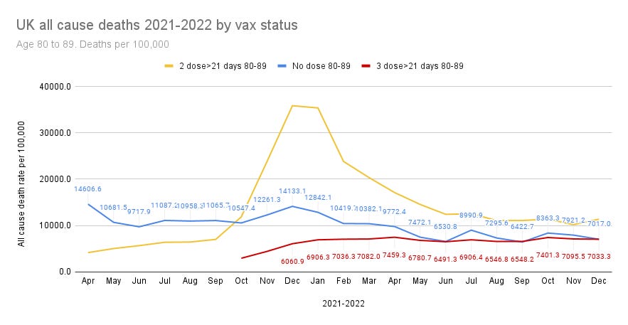
The pattern is very similar with the yellow 2 dose group dying at a lower rate than the unvaccinated until a rise that starts in September & rises to a high in December.
Those who had a third dose died at a much lower rate from October.
Around June 2022 the death rate of the unvaccinated had fallen to about the same as the 3 dose group, but the 2 dose group continued to die at a higher rate.
The next age group is plotted on a different scale because the death rate maximum is about half the death rate maximum for the 80+ group.
70-79

A similar pattern with the 2 dose group having a lower death rate than the unvaccinated until October/November when the 2 dose death rate shoots up.
In October the 3 dose death rate is much lower & stays below the unvaccinated death rate through the entire period.
The next age group is graphed on a different scale because the death rate in the 60-69 age group hits a maximum of 4,000 compared to about 15,000 for the 70-79 age group.
60-69

Very similar pattern. Two dose doing better than no dose. This time continuing to do better until December, then doing worse. The 3 dose group doing better and having a flat line response until the end of the period.
The next age group again sees a much lower death rate maximum at about a quarter of the maximum for the 60-69 age group.
50-59
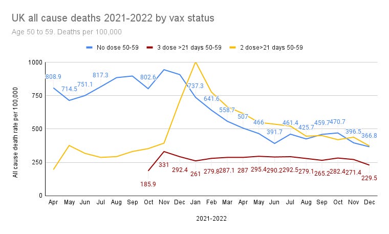
Slightly different in the 50-59 age group. The rise of death rate in the 2 dose group exceeds the unvaccinated later than the older groups, crossing the line at the start of January. The peak it reaches is not so greatly much higher in this age group. The 3 dose group completes the period always below the unvaccinated.
The next age group has a maximum death rate below 400 compared to the previous age group at 1,000.
40-49
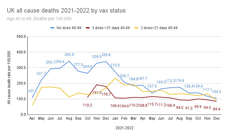
This 40-49 age group is notably different. The 2 dose group does not go above the unvaccinated group. Instead it rises to the same level by February. The 3 dose group temporarily exceeds the 2 dose group and then stays below both groups. Note that the numbers are getting smaller and so there is more chance of random noise involved.
The next age group is a larger population with more of an age spread. This makes the data less comparable. The maximum death rate in the 18-39 is about a third of the rate in 40-49.
18-39

The age range of 20 years and the much smaller numbers of deaths makes this graph less reliable than the older age groups.
It shows 2 dose group initially with a higher death rate than the unvaccinated, but then falling below it. There is a small increase in December. The 3 dose group initially seems to be doing worse than the 2 dose, and by the end there is no significant difference between the three groups.
Mortality & age
The death rates per 100,000 person-years in each age group are strongly related to age.
Taking the peak death rates in each age group for the unvaccinated
90+ 36,326
80-89 14,607
70-79 6,212
60-69 2,697
50-59 945
40-49 342
18-39 90
and converting that into a graph, using a mid age in each age group, shows one very obvious thing. The death rate rises exponentially with age. The match to the exponential is surprisingly close.
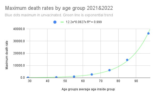
The equation of that exponential death rate rise is:
12.2 e^0.0827age
Of course, all risk mortality normally follows a similar trajectory
Methods
The ONS data was downloaded as a CSV file
This was loaded into Google Sheets
The months names were converted into numbers to make sorting into chronological order easier.
A pivot table was created with the following
Rows: Years, month, age standardised rate per 100,000
Columns: age, vaccination status
Filters: Age, Vaccination status, month, cause of death (all cause)
Each age group was filtered separately 3 times, 1 for each vaccination status (unvaccinated, 2 dose more than 21 days, 3 dose more than 21 days)
The displayed death rates were copy and pasted into a new sheet in which graphs were produced
With thanks to James Neill who introduced me to pivot tables